
Data tables are the beating heart of FinalForms. Used daily by tens of thousands of athletic directors, coaches, school nurses, and district administrators, these interfaces are the primary operational engine for managing high-stakes compliance data. Every single day, users rely on them to perform legally binding actions—from verifying a student’s medical clearance to play a sport to certifying state-level enrollment status and athletic eligibility.
For the past 13 years, the underlying architecture has carried the weight of this workflow. However, it has evolved into a monolithic legacy system that struggles to support the dynamic needs of its diverse user base. A school nurse looking for immunization records and a district athletic director auditing multi-school rosters require entirely different lenses into the data, yet they have historically been funneled through the same rigid interface.
Redesigning the FinalForms data table ecosystem is not merely a visual update; it is a fundamental system modernization. The challenge lies in creating a unified, highly adaptable component architecture that seamlessly switches context between Academic, Athletic, Extracurricular, Medical, and Enrollment modes—all while scaling effortlessly from a single school building to an entire district. This case study explores how we untangled 13 years of legacy workflows to build a flexible, high-performance table system capable of handling complex compliance at scale.
Discovery: Building the Room (Quarterly Workshops)
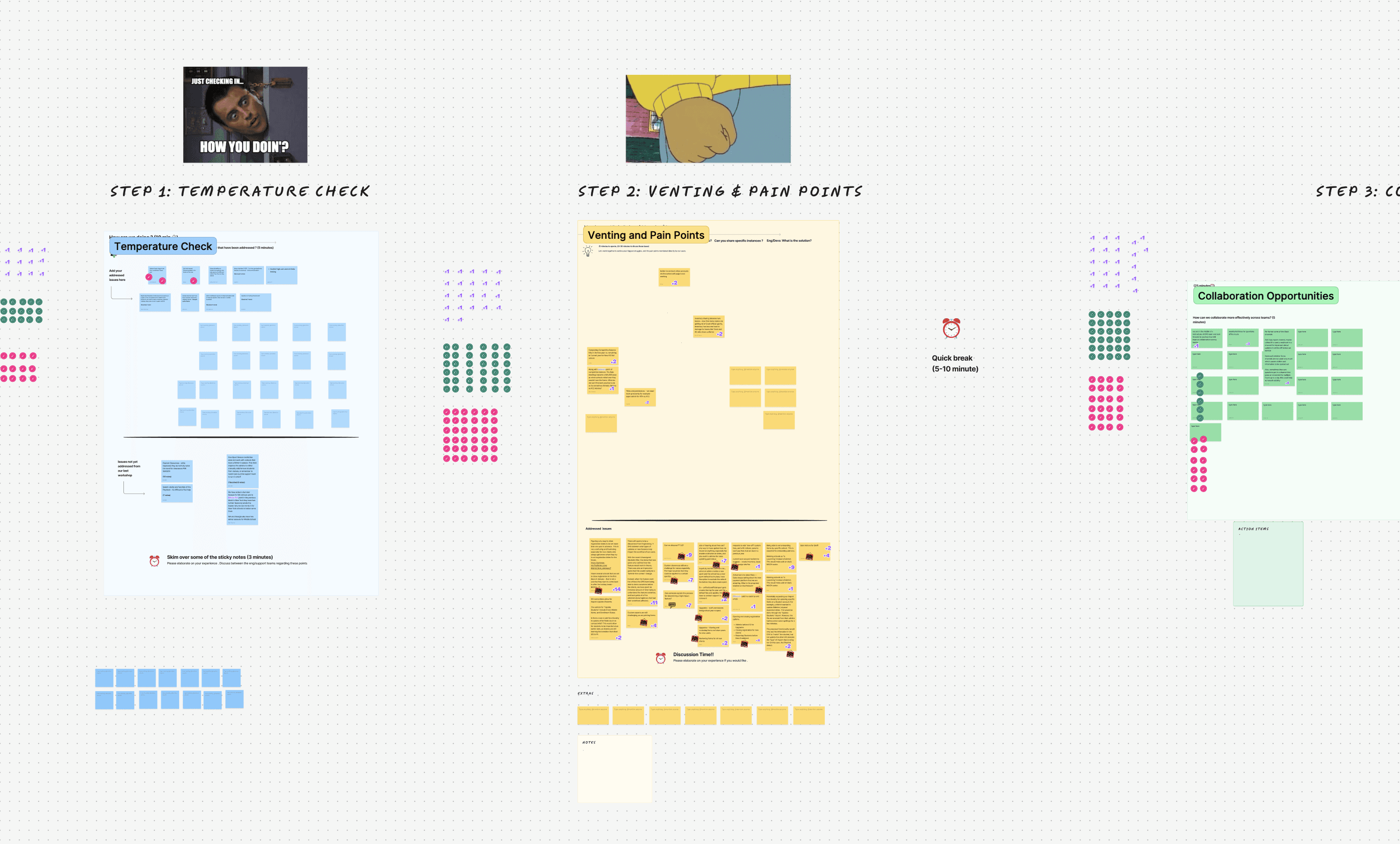
I started running a quarterly, 90-minute workshop that pulled over 60 teammates (engineering, support, onboarding, and sales) into one facilitated space: a temperature check, venting & pain points, collaboration opportunities, and an open forum. This allowed our team members who all interact with clients differently, to air out their thoughts as to what aspects of our software should change (with a lot of the issues being tied to our data table).
Widening the Investigation
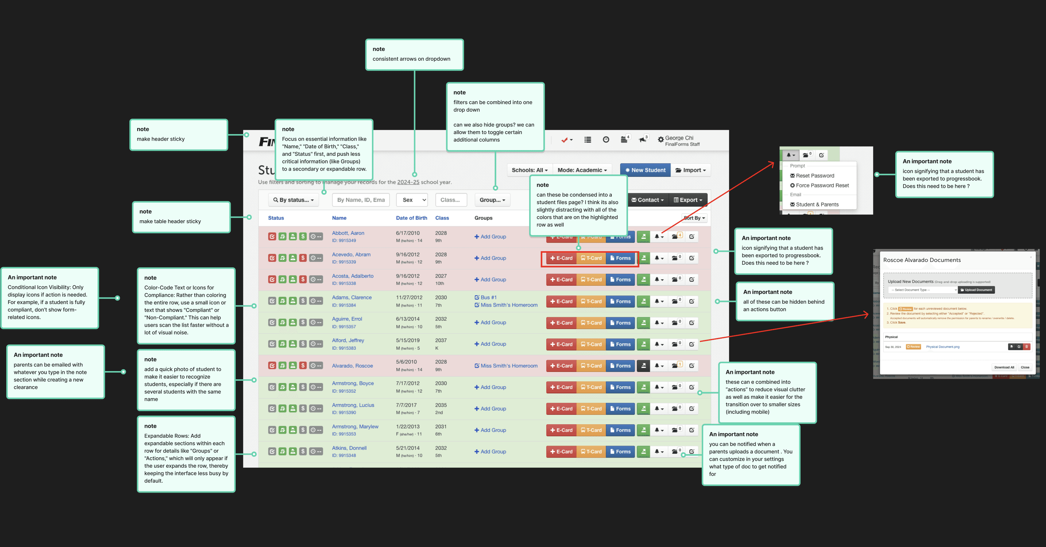
Alongside the workshops, I ran individual meetings with teammates who flagged specific interface concerns, and sat in on calls with the sales team specifically to understand what they were hearing from prospects and why we were losing deals. Some of what surfaced was directly tied to the table functionality.
(photo0
Sythesize
I synthesized everything: workshops, one-on-ones, the competitors UI, and sales calls, and logged all of my findings. I then extracted the requests related to the data tables.
The questions behind a year of work
This redesign ran about a year because every decision had downstream effects across five modes, three personas, and two platforms. A sample of what had to be worked through:
Which tasks belong on mobile (and whether admin work on mobile worth the engineering effort)
Multi-select & bulk actions
Inline filtering
Infinite scroll vs pagination at scale
Row-level vs table-level actions
Which user types rely on each of the five modes
How permissions change what a user even sees
Full keyboard-only completion and color accessibility
Onboarding a first-time user to a table this dense
Whether profile photos help scanning (especially repeated last names)
Which single column the eye should land on first
Truncate vs horizontal scroll on smaller screens
How advanced filters and sorting behave when combined
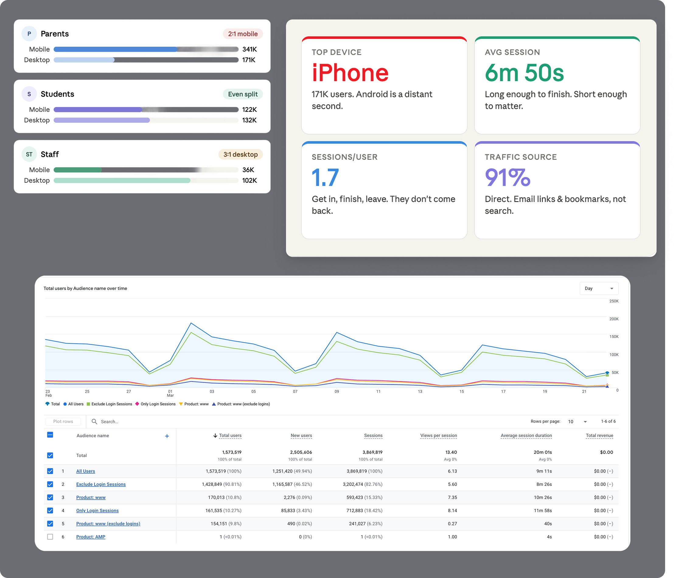
What the Data SaidBefore deciding how mobile-first this redesign needed to be, we looked at real GA4 usage data across 1.54 million users and found:
Parents are 2:1 mobile to desktop usage : Their experience/main tasks with the data table should be most optimized for the mobile experience.
Students usage was split nearly evenly between desktop and mobile
Staff (the actual users of this table) , are 3 to 1 desktop: signifying /leading us to the decision that the experience and the primary staff(admin) tasks should be optimized most for the desktop experience.
We also found gaps in our own tracking along the way, an overly broad "guest" tag catching 650K+ desktop sessions with no clear definition. This data is key in helping us shape the various modes of the table, based on which persona is using them.
Stress-testing the patterns
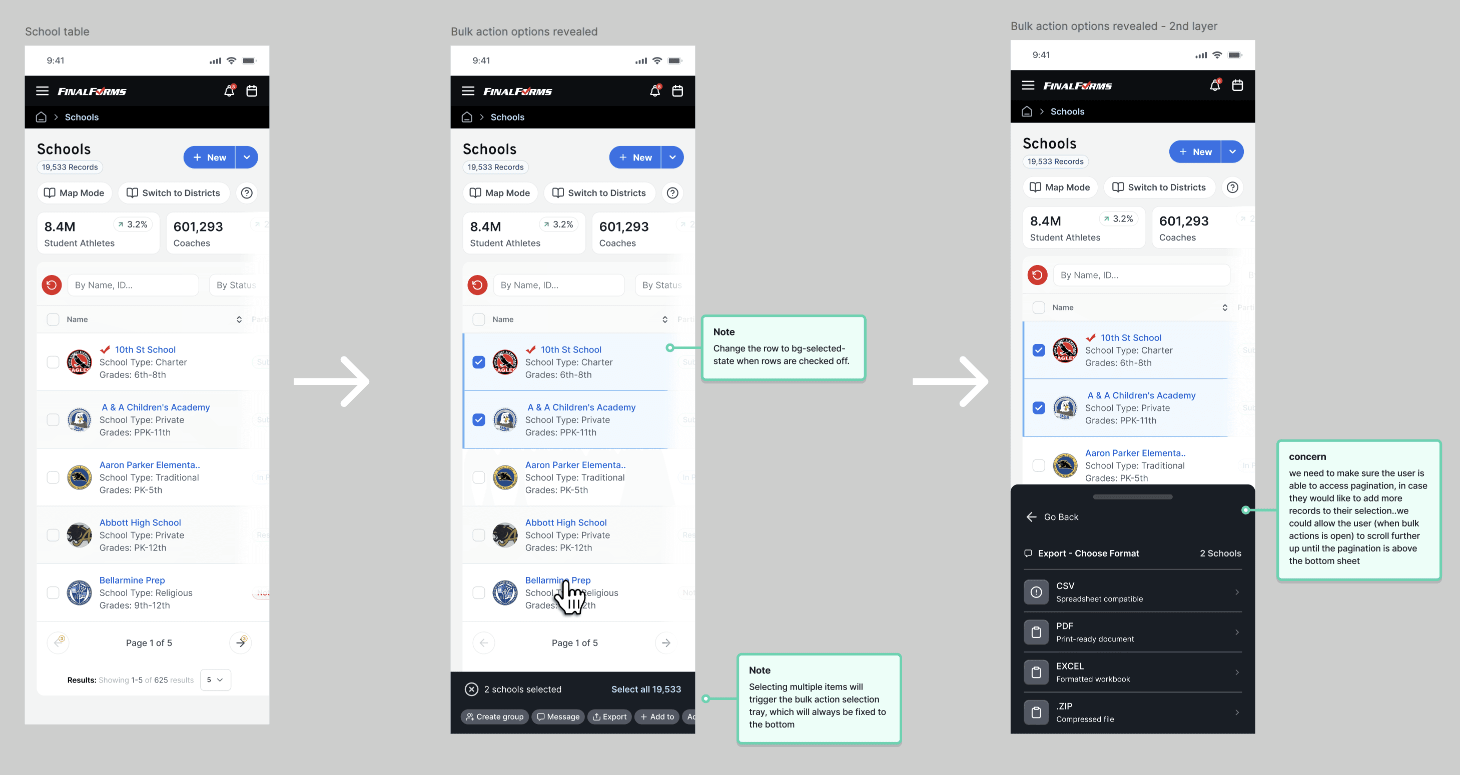
A data table is much more than the displaying of rows and columns of data: There are a myriad of patterns that go into building a scalable, high-velocity workspace. All of the patterns were thoroughly researched, and tested, with internal staff, as well as real-life users to make sure the user could accomplish their tasks easily, and to reveal any potential edge cases. Certain flows, that were categoeized as an admin task, were optmized for desktop, whereas a task a student or parent would be executing, were optimized for movile.
While the full system encompasses dozens of granular interaction models, I selected six key patterns to highlight how we stress-tested the UI against complex, everyday user workflows:
Adding a Column (Customization): Allows users to tailor data density to their specific role—letting power operators surface critical fields while hiding non-essential metrics to streamline daily tasks.
Loading State (System Feedback): Prevents UI layout shifts during asynchronous data fetches, maintaining visual context and managing user expectations during heavy server calls.
Sorting (Data Scannability): Enables rapid reorganization of vast datasets by priority, recency, or alphabetical hierarchy without losing visual anchor points.
Bulk Actions (Workflow Efficiency): Accelerates high-throughput management by allowing users to select records across pages and execute batch operations in a single step.
Pagination (Performance & Structure): Breaks thousands of records into manageable, performant chunks—reducing cognitive load while eliminating browser rendering bottlenecks.
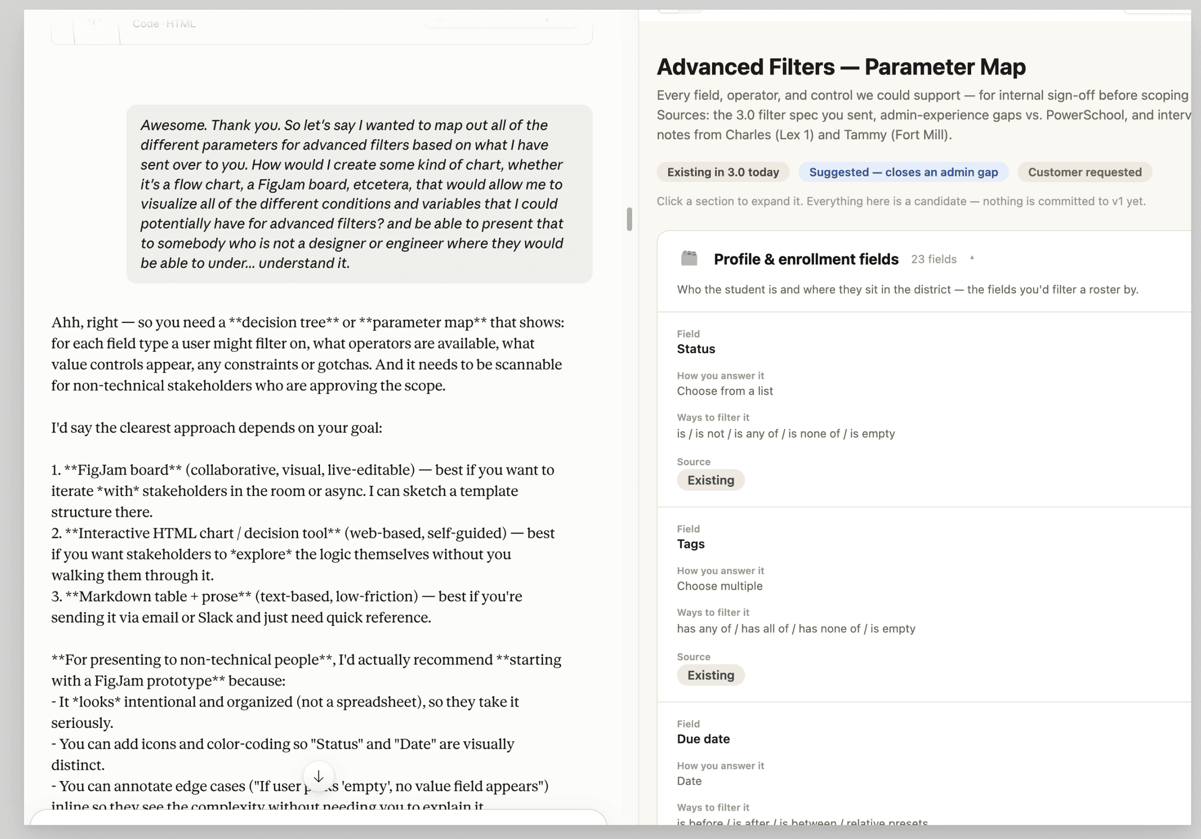
Advanced Filters (Targeted Discovery): Empowers users to layer complex criteria logic to slice through large datasets and isolate exact data points instantly.

Where AI fit in
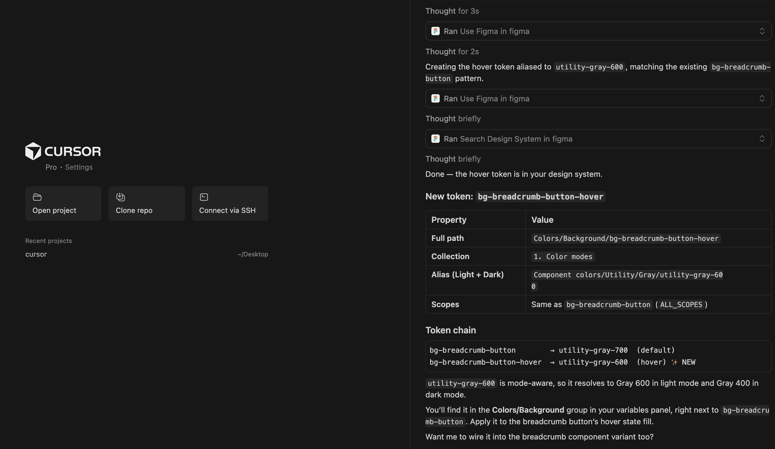
Cursor (connected to the Figma design system) handled execution and enforcement, naming consistency, mass token binding, light/dark mode aliases. Claude acted as a design-critique partner for pressure-testing directions before CPO/engineering reviews, and helped structure advanced filter parameter maps stakeholders could actually follow.


Results
This hasn't launched, so there's no adoption number yet. The real measure is what's actually ready to ship when we launch the :
A fully documented, stress-tested pattern library covering all five table modes, ready to hand to engineering with exact specs, not just direction
Every major change traces directly back to a named audit finding or a specific request from the team or sales, not a personal preference
Roughly a year of work across systems that make up 75% of the product's views, once shipped, this will directly affect the tens of thousands of coaches, nurses, registrars, and admins who touch this exact table every day to do compliance-critical work

