Mythology Distillery

Company

Timeline

Role

UX/UI Designer

Project

Streamlining Ticket Distribution for Universities
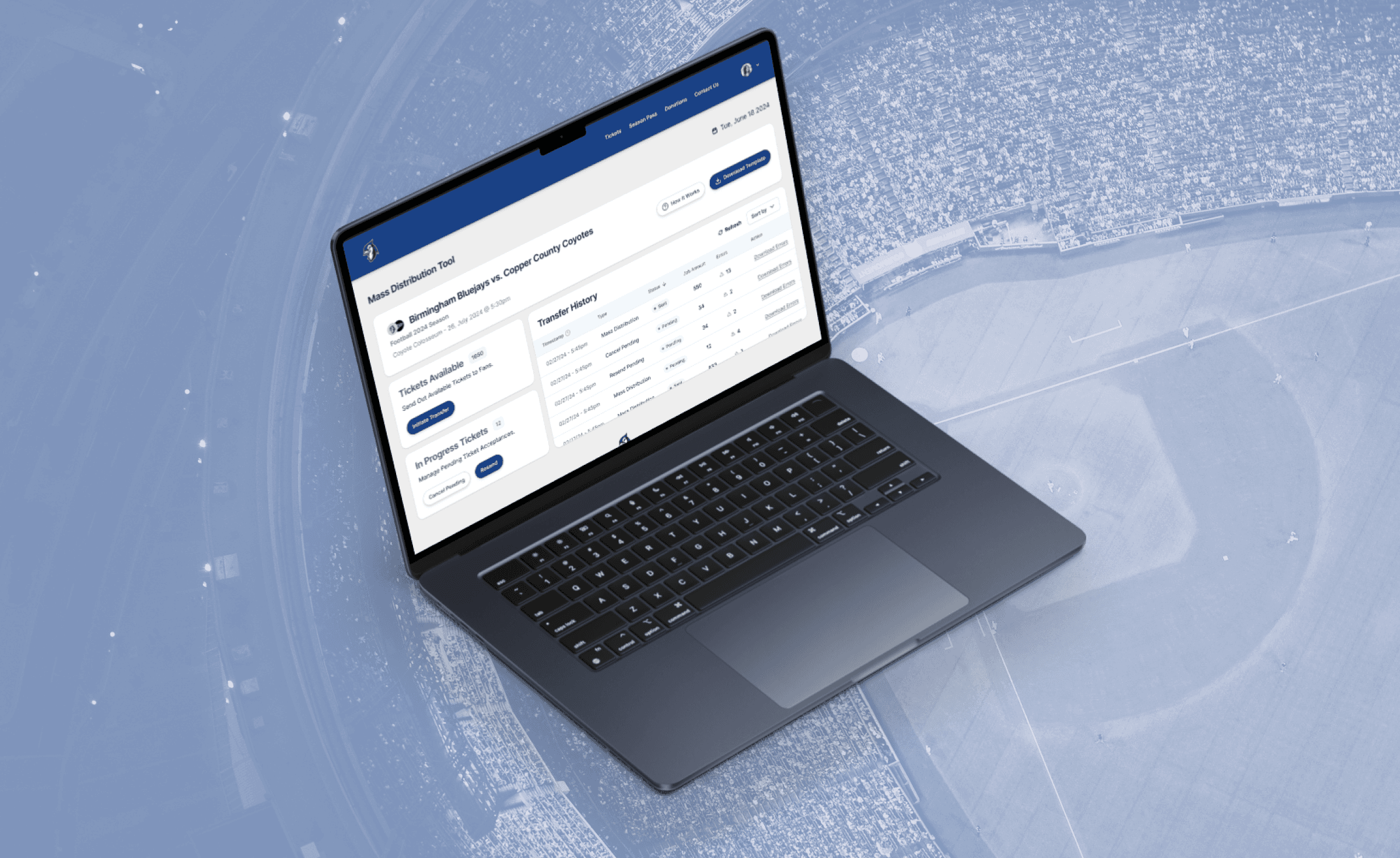
(This case study has been anonymized to safeguard sensitive company information. Any similarities to actual companies, organizations, or proprietary data are purely coincidental.) A anonymous leading ticketing company specializing in college athletics provides comprehensive ticketing and event management solutions. One significant challenge the company was facing involved the efficient distribution of visitor team tickets during sporting events hosted by the home team.
ClientTicketing Company
RoleProduct Designer
Year2024


Problem Statement: Visitor teams encounter complexities in distributing their allocated tickets, involving manual compilation of student requests, submission to the home team, and labor-intensive individual ticket distribution. Existing solutions within the company's ecosystem do not extend to schools partnered with competitors, necessitating a new approach for seamless ticket distribution.


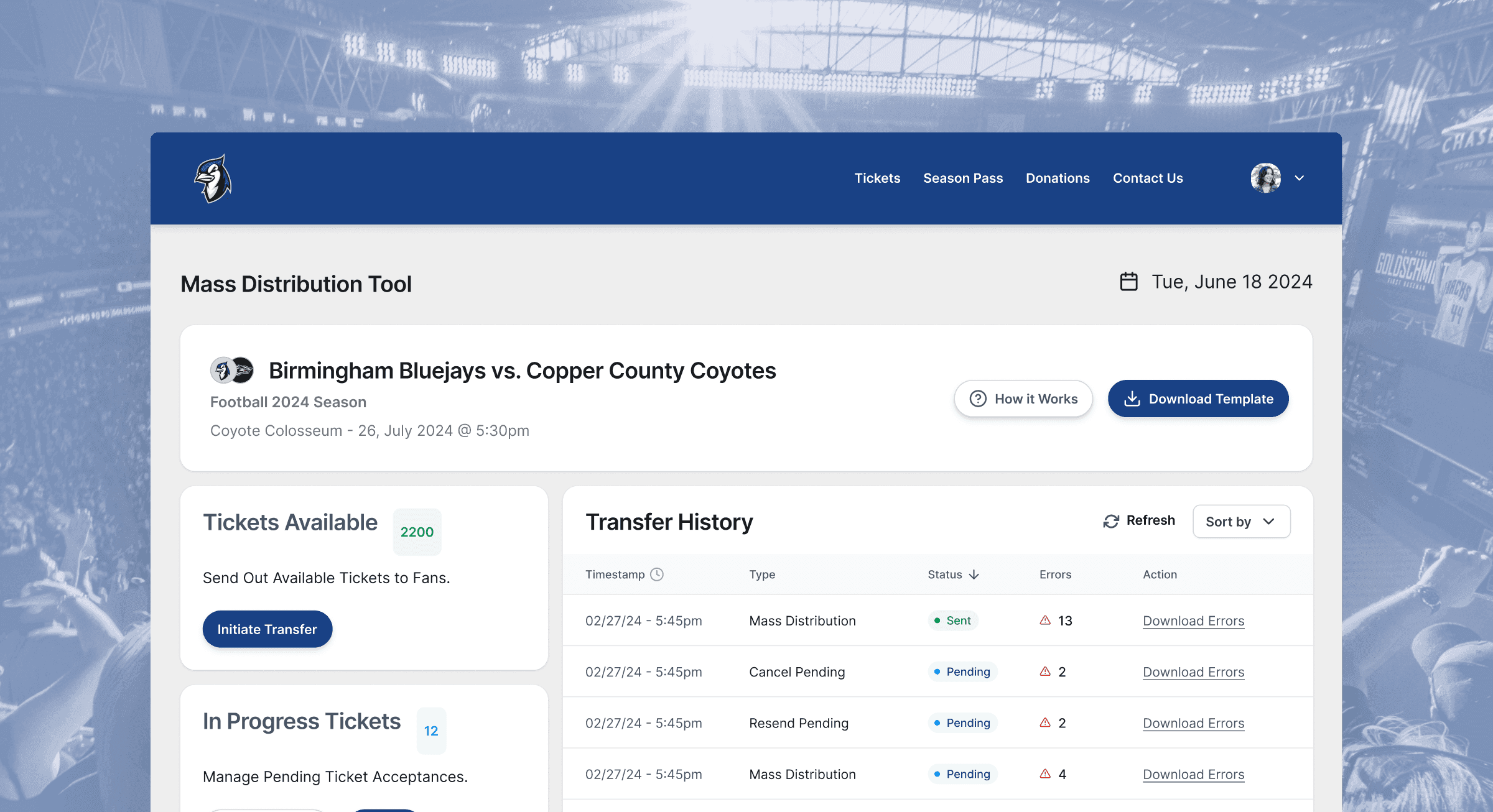
Solution: The solution proposed was a Mass Distribution Tool designed to simplify and expedite the ticket distribution process for visitor teams. This tool allows the visitor team to upload a pre-filled spreadsheet of ticket recipient details. Upon submission, tickets are automatically sent out en masse to their fans, rather than the need for home teams box office employees having to spend time manually processing each individual ticket (which can range in the thousands).
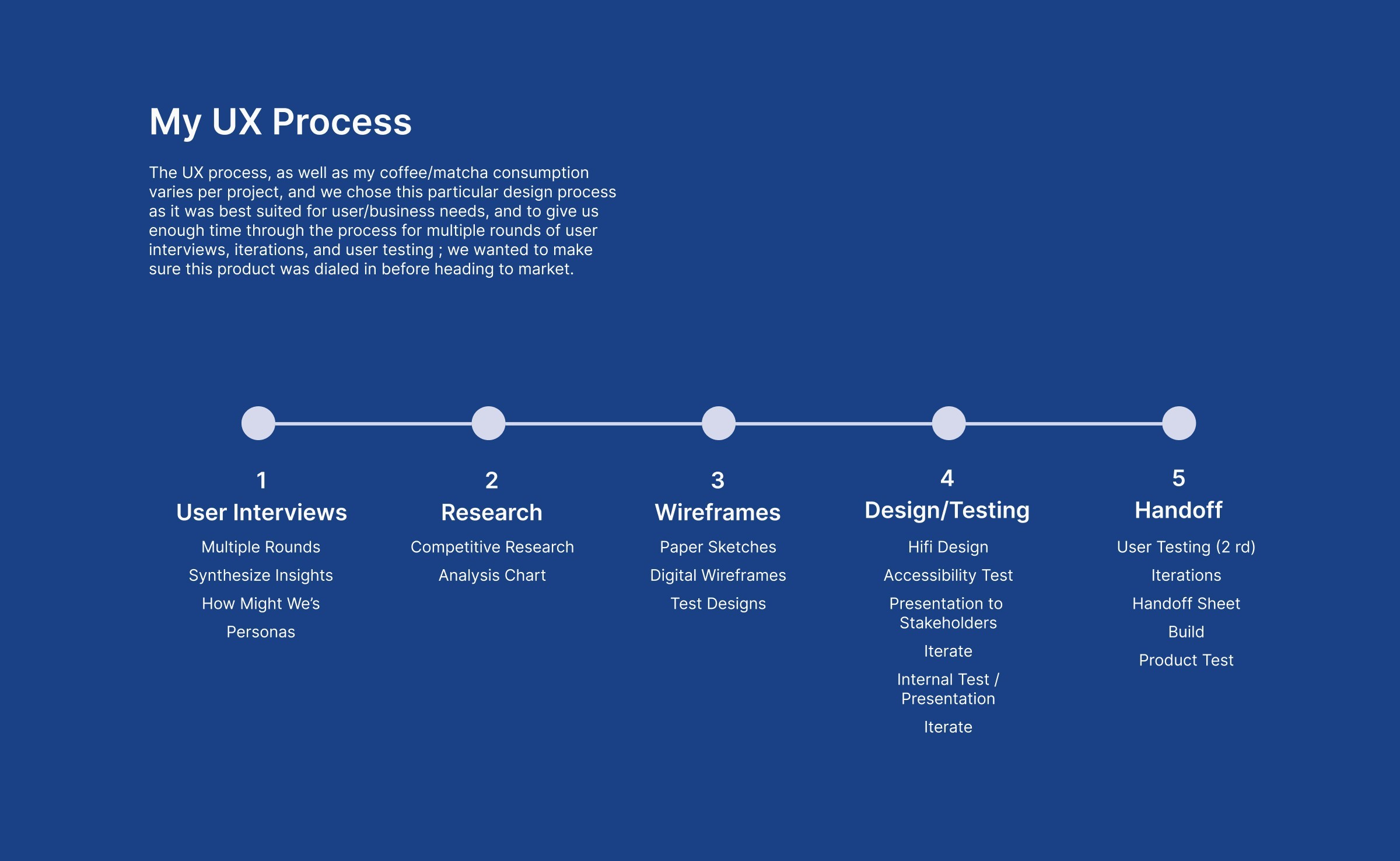


Roadmap


Key Features


  1. CSV Spreadsheet: Users can easily compile all of their ticket information into a .csv file

  2. Mass Distribution: Tool processes and sends tickets (up to 2000) to designated recipients.

  3. Error Resolution: Ability to access error logs to directly fix any transfer issues.

  4. Status Reports: Tracks ticket status (accepted, pending) and generates reports.

  5. User Guidance: Includes a 'How It Works' section with informational walkthrough for user assistance.

  6. Event List Page: Allows visitor teams to access ticket management for all upcoming games


User Research

(Specific user research details, and commentary will be left out to protect IP)


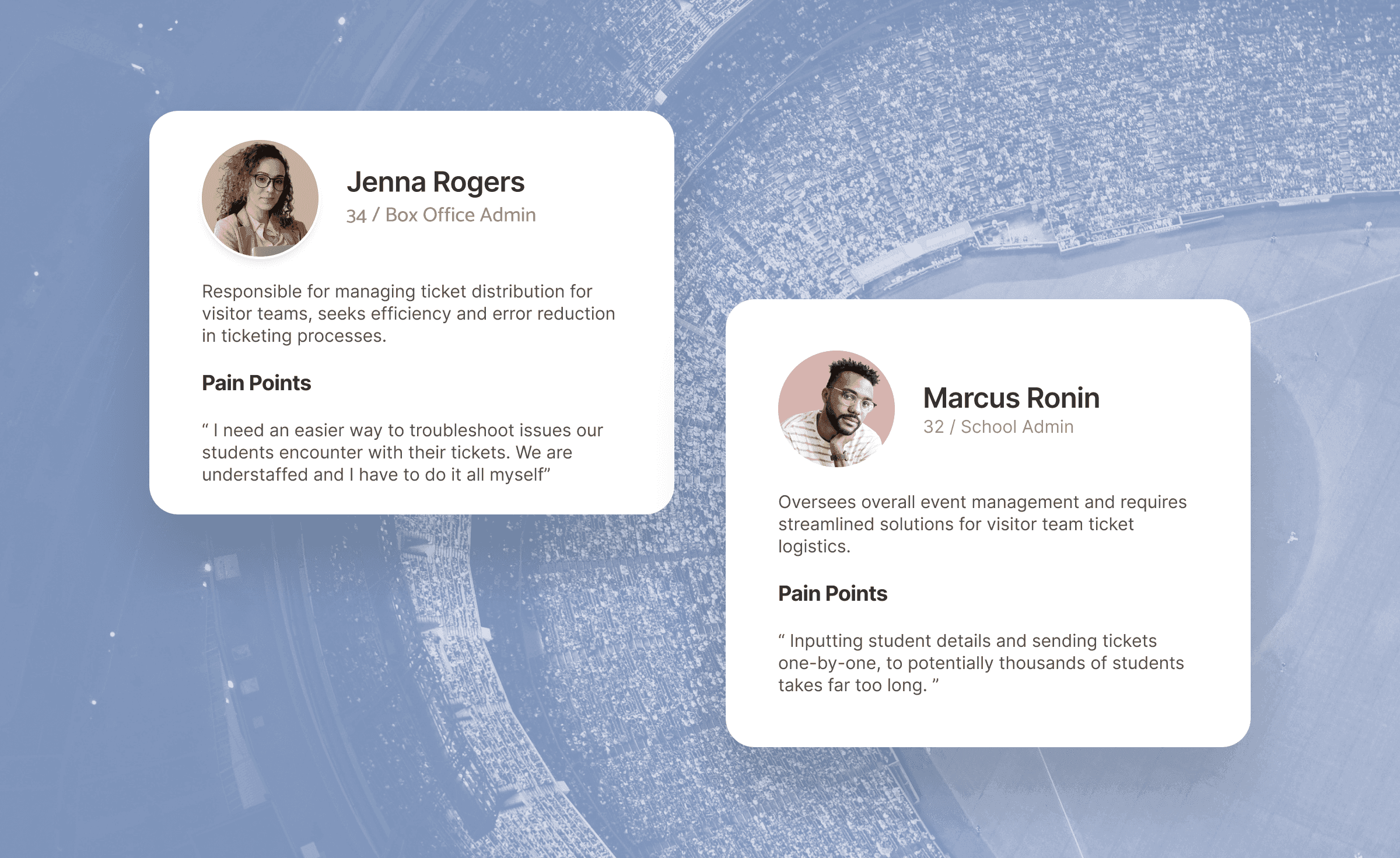
User-Centric Approach: The project began with five rounds of user interviews conducted over three weeks, engaging approximately 15-20 clients from various universities. These interviews provided deep insights into existing frustrations and pain points with ticket distribution processes. From the first interviews, we got a sense of the typical journey map, which we walked through with the stakeholders during workshops to have them drop their feedback ; Feedback highlighted the need for automation, error reduction, and improved efficiency.


Some examples of questions we were seeking answers to were:

- What obstacles do you typically encounter when collaborating on ticketing with visiting schools ?
- How many tickets do you generally send out to visitor teams per game (& per sport)?
- Are there difficulties troubleshooting tickets that are sent out?
- How many unaccepted tickets are usually claimed at the box office on game day? How can we minimize this , and create less of a workload for box office employees?


Once enough information / insights were gathered , we developed multiple personas , plugging in each persona into a journey map


Wireframes:


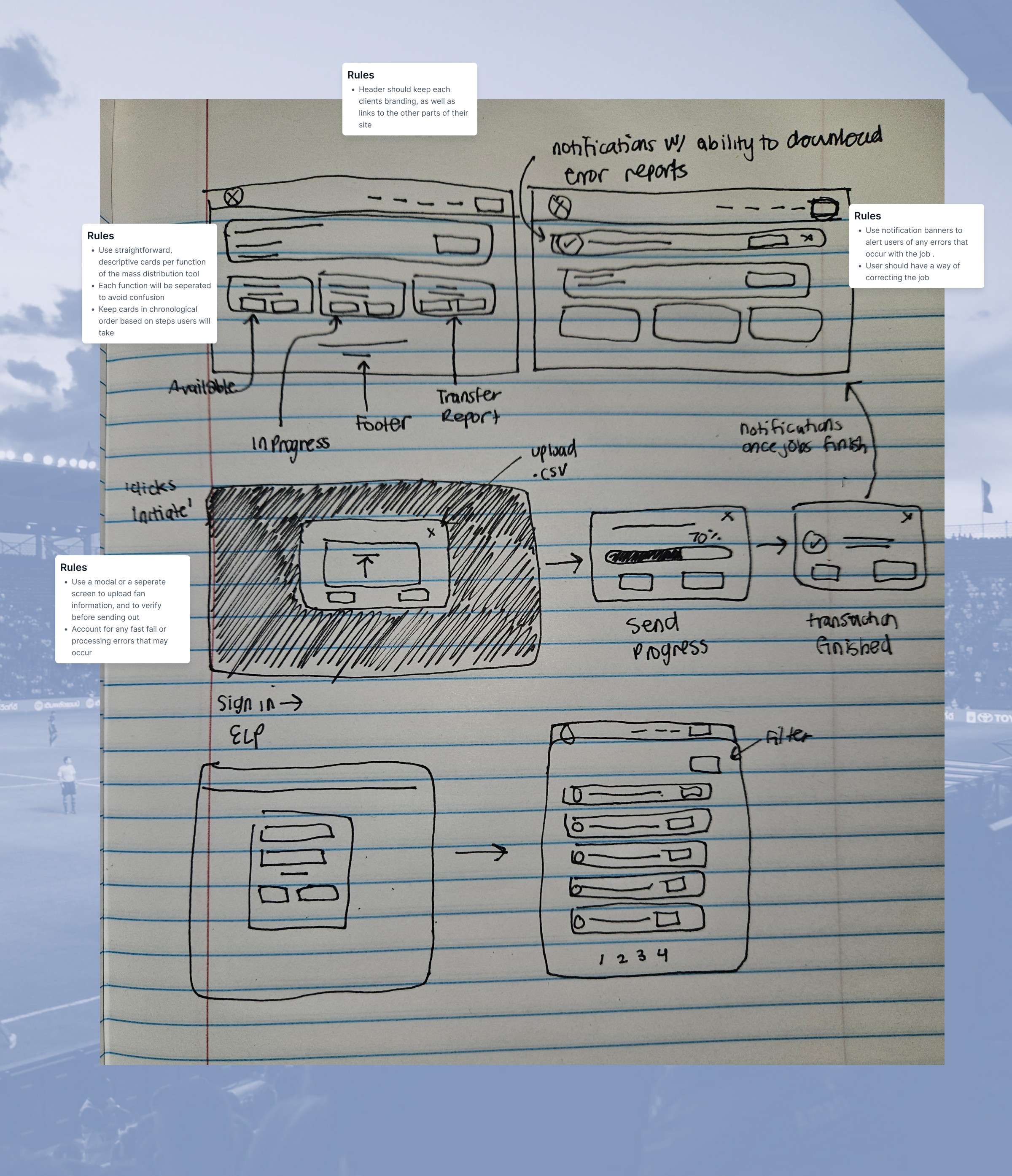
Wireframes were constructed from the insights gathered. We wanted to make sure that the tool constructed would be straightforward, easy-to-use, and accounted for any type of error the user may encounter while trying to resend, cancel , or initiate transfers.


Iterative Design Process:


Based on insights gathered from user interviews, mock-ups and prototypes were developed and tested with stakeholders and end-users. The iterative testing phase included user testing sessions with college athletic clients to validate functionality, usability, and overall user experience. Feedback from these sessions informed iterative improvements to the tool's interface and functionality. These improvements included:


  • Eliminating Notification Banners: In Version 2, the decision to replace notification banners with a comprehensive Transfer History Table improved user experience. This ensured that users could easily track and manage ticket transfers without the risk of losing critical notifications upon logging out.


  • Removing Unnecessary Content: In Version 2, we removed the 'transfer download report' card to reduce clutter since the new Transfer History Table would serve to show all pending, canceled and successfully sent transfers. This also removes the need for the users to download and sift through a separate .csv file, saving our users even more time.


Technical Considerations:

  • System capacity limitations sending tickets in batches, with a cap of 500 tickets per batch to maintain system performance.

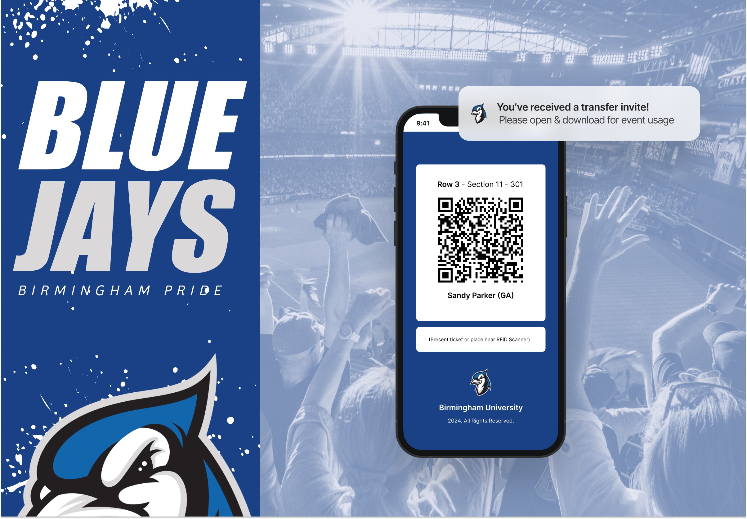
  • Notifications via email were implemented to alert users of transfer progress, accommodating busy schedules and minimizing user involvement during the process.

  • Addressing potential errors (e.g., invalid file types, duplicate tickets) through detailed error messaging and validation.


First Round of Iterations:


Additional Iterations:


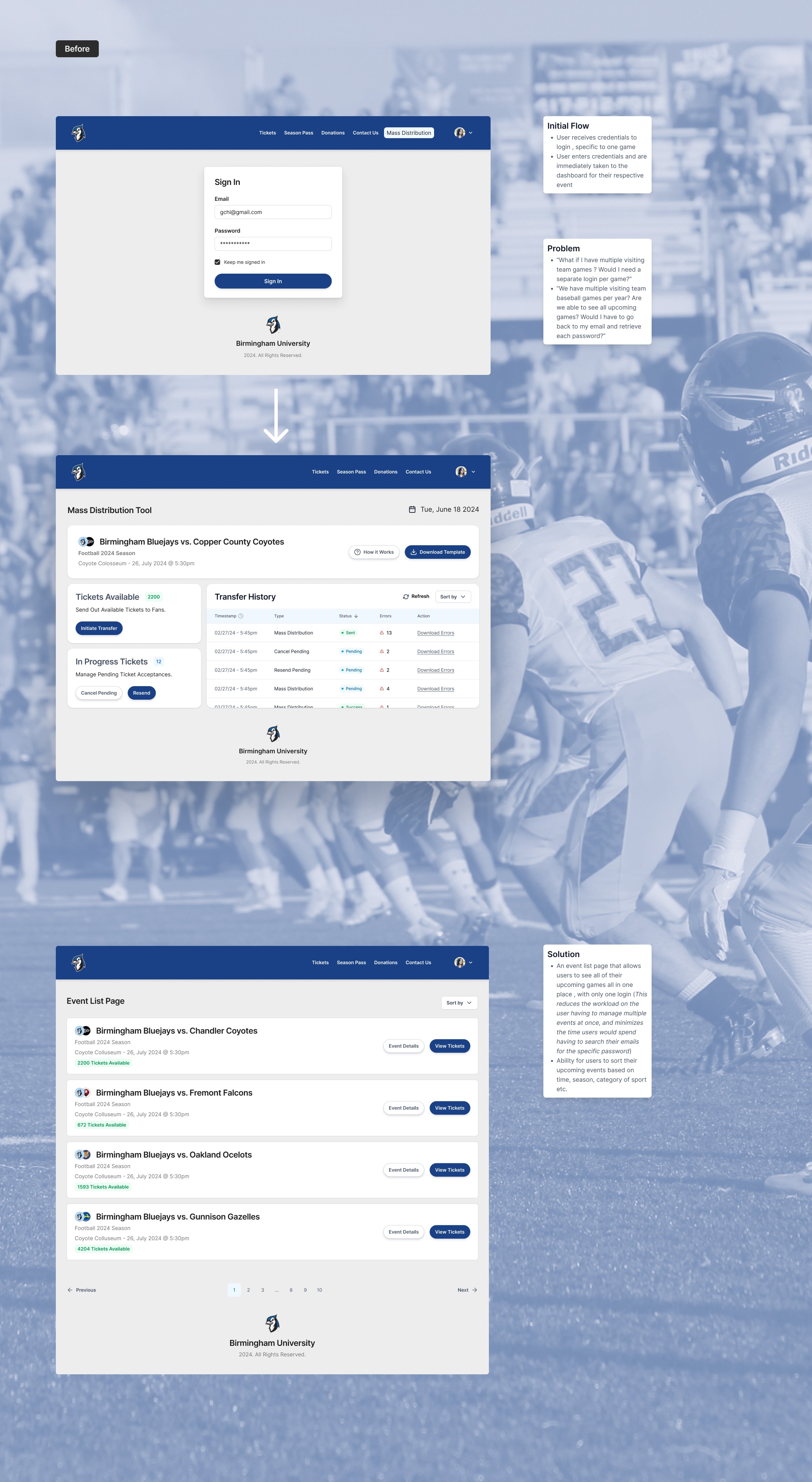
  • All of Your Games in One Place: Initially based on technical restrictions / timing to push the product out to market for testing, our first version only allowed users to manage tickets for one event per login credentials. I argued for the expansion of the interface , to allow users to be able to handle all of their events in one place (kind of like an all-in-one portal). I wanted to make sure that the user experience was not tarnished by having to have the users memorize credentials for each event (especially if they have upwards of 50 visitor games per year) , or go through their emails to track down several different passwords.


  • Additional Information: On Version 2, on the event list page, extra details were added, allowing the user to get a preview of crucial information (number of tickets remaining, event location, event time, season, sport, etc.) saving users time from having to click into an event and find the information themselves.


Impact


The Mass Distribution Tool significantly enhances operational efficiency for both home and visiting teams:

  • Saving Time: Reduces manual labor at home team box offices, allowing staff to focus on other tasks.

  • Improved User Experience: Simplifies the ticket distribution process for visiting teams, enhancing overall client satisfaction.

  • Scalability: Designed to handle high volumes of ticket transfers, accommodating up to 2000 transfers at a time.

  • Adaptability: Provides flexibility with dual delivery methods (email and text message) and ability to manage errors.


A brief look at the typical user flow of the Mass Distribution Tool



Conclusion


  • The Mass Distribution Tool introduced by the ticketing company addresses critical pain points in visitor team ticket distribution, enhancing operational efficiency for both home and visitor teams. By leveraging user-centric design principles and iterative development, our team did not only improve user experience but also streamlined a complex process, setting a new standard in collegiate athletics ticketing solutions.


    Takeaways:

  • Though this was an expedited project, I appreciated the collaboration with the PM (She's a rockstar , seriously) and how we went about tackling the rounds of user interviews . I truly think that it helped pave our deep understanding of the users pain points, and made the design process more smooth

  • For future iterations , I would like to add in the ability within the table to cancel single transfers (utilizing checkboxes) as well as the ability to correct the errors via the table vs. mass editing with the csv

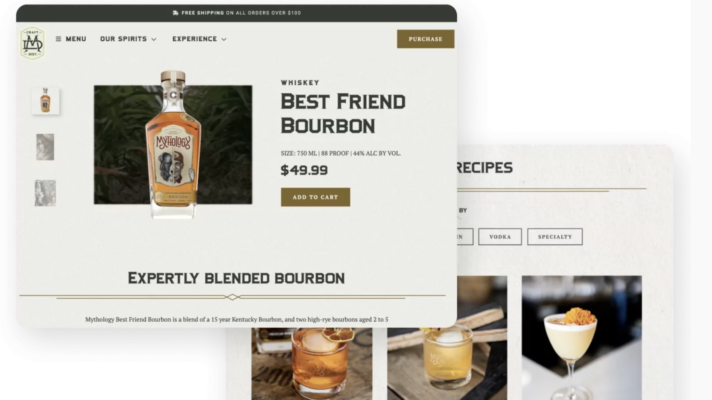
Mythology Distillery is a Colorado-based liquor distillery known for its unique whiskey blends, handcrafted gin, and a distinctive Colorado lifestyle brand image.

View Website Here


Problem:

How might we enhance the user experience and drive direct-to-consumer (DTC) sales for Mythology through a website redesign that effectively communicates product information, fosters visitor engagement and expand their email database?


Solution:

Our team designed a website that improved user experience, promote DTC sales, featured product information, cocktail recipes, brand story, distributor network, and marketing materials. We also added in essential features including an interactive ‘Where to Find Us’ map, cocktail recipe generator, and awards sections. A ‘Spirit Animal Quiz’ was also integrated to engage visitors and grow the email database (feel free to interact with it on their website 😃).


Team:

  • UX/UI Designer

  • Sr UX Designer

  • 2 Project Managers

  • 2 Developer

  • SEO Specialist


Though I came into this project during the second half of it, I contributed to the product’s growth through:

  • Wireframing

  • UX/UI Design

  • Creating the Spirit Animal Quiz Experience

  • Distributor Page

  • Spirits : Gin Page

  • QA / Handoff to Dev


Our team started the work by by following establishing a solid understanding of the SaaS and working on gathering insights from users.

  1. Define the target audience: The first step was to identify the target audience and their needs, pain points, and preferences. Since Mythology was a well-established distillery , with a specific target audience, we were able to draft up new personas that could also be interested in their products.


  1. Create wireframes: Wireframes were drafted for the new site; We wanted to reimagine their website with more interactivity , easier navigation through the sales process, and more easily accessible


  1. Design: Once the wireframe were approved, the designs were implemented and finalized. This step involved incorporating branding elements, such as colors, fonts, and imagery, as well as optimizing the layout and design for mobile responsiveness and user experience. During this process , I collaborated with the Sr. UX Designer , as well as developers to make sure we were balancing user needs, stakeholder needs, and making sure it was a plausible build within the dev teams capabilities / hours.


  1. Develop: Throughout the design process, I was in direct and constant communication with the dev team, making sure the designs wouldn't go over the allotted hours. Once the design system was dialed in, I exported all necessary assets, and handed it over to be developed


  1. Final Audit: Once the site was developed , I scanned through a few more times on tablet, mobile, and desktop to make sure the designs hierarchy / aesthetic were in line with the design system, revisited to make sure there were no glitches.


A Roadmap to Enhanced Consumer Engagement: The Strategic Blueprint for Mythology Distillery


Our team worked closely with Mythology Distillery to build a strategy centered on showcasing the brand’s unique offerings and values, focusing on their new Steamboat campus, and promoting their craft whiskeys and gins. Key goals were to increase brand awareness, optimize online sales, educate customers with cocktail recipes, and share information about their new Colorado destination.


Turning Vision into Reality: The Development of Mythology Distillery’s Enhanced eCommerce Platform


Faster, More Seamless Checkout = Less User Dropoff & More Transactions

In the website development phase for Mythology Distillery, a key priority was ensuring seamless integration with AccelPay, a leading payment processing platform. This emphasis was driven by the goal to provide an efficient, secure, and user-friendly checkout experience, which is critical in a successful eCommerce platform. The development team, therefore, invested significant effort in creating an intuitive interface that minimizes transaction friction. The end result was an uncomplicated checkout process, instilling confidence in consumers and reinforcing their connection with the brand.


Parallelly, the website’s architecture was refocused to bolster Direct-to-Consumer (DTC) sales, aligning with Mythology Distillery’s strategic business objectives. The redesign aimed to streamline the buyer’s journey, guiding customers seamlessly from product discovery to final purchase. This involved crafting concise product descriptions, implementing easily navigable product categories, and designing compelling calls to action. Moreover, the omnipresence of AccelPay throughout the site ensured an ever-accessible, straightforward pathway to purchase. This strategy not only boosted DTC sales but also fostered a cohesive, integrated shopping experience across the website, enhancing the connection between Mythology Distillery and its customers.


Enhancing Client Interaction & Building Brand Loyalty:
Spirit Animal Quiz


  • One of the stakeholder requested features was to add a spirit animal quiz

  • The idea would be to answer a string of questions based on personality type, hobbies, and which type of environment the user feels most “at home” in, and generate the corresponding animal.

  • Each spirit animal pairs with its respective alcohol from Mythology Distillery with a CTA to lead / funnel users to the product page.


    Result: The spirit animal quiz we constructed resulted in a personalized experience for users, connecting their personality traits with Mythology Distillery’s offerings. Participants discovered their spirit animals such as the Best Friend, each paired with a corresponding Mythology alcohol like the "Best Friend Bourbon". This interactive journey not only enhanced client interaction but also fostered brand loyalty by linking unique user identities with compelling product experiences.


Results:

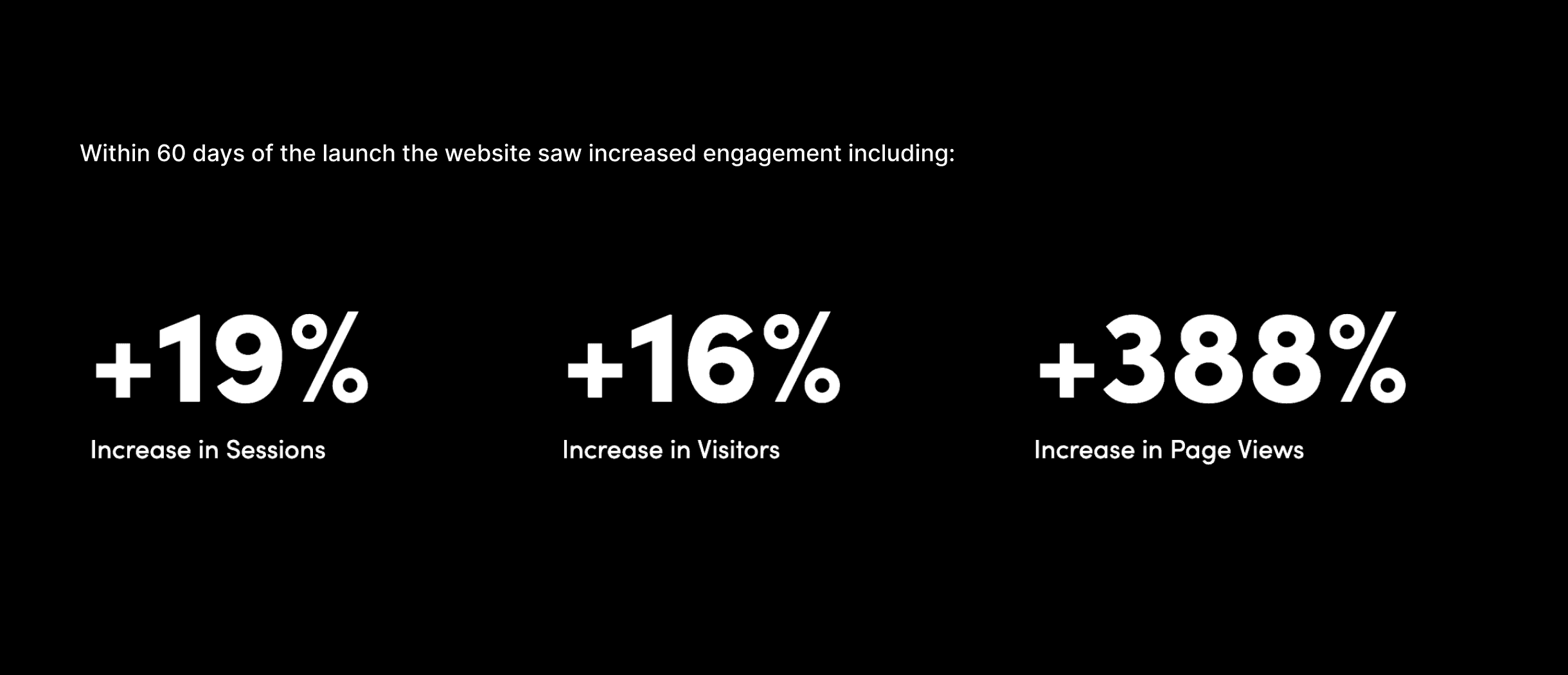
The website redesign, new integrations, and SEO tweaks resulted in an evident increase in visitors, and user retention.

(More results shall be added soon)


Results

0

0

Ready to bring your ideas to life? Let's start the conversation.

Denver, CO

2:11 PM

Socials

© 2026 George Chi

Product & UX/UI Design

Ready to bring your ideas to life? Let's start the conversation.

Denver, CO

2:11 PM

Socials

© 2026 George Chi

Product & UX/UI Design